
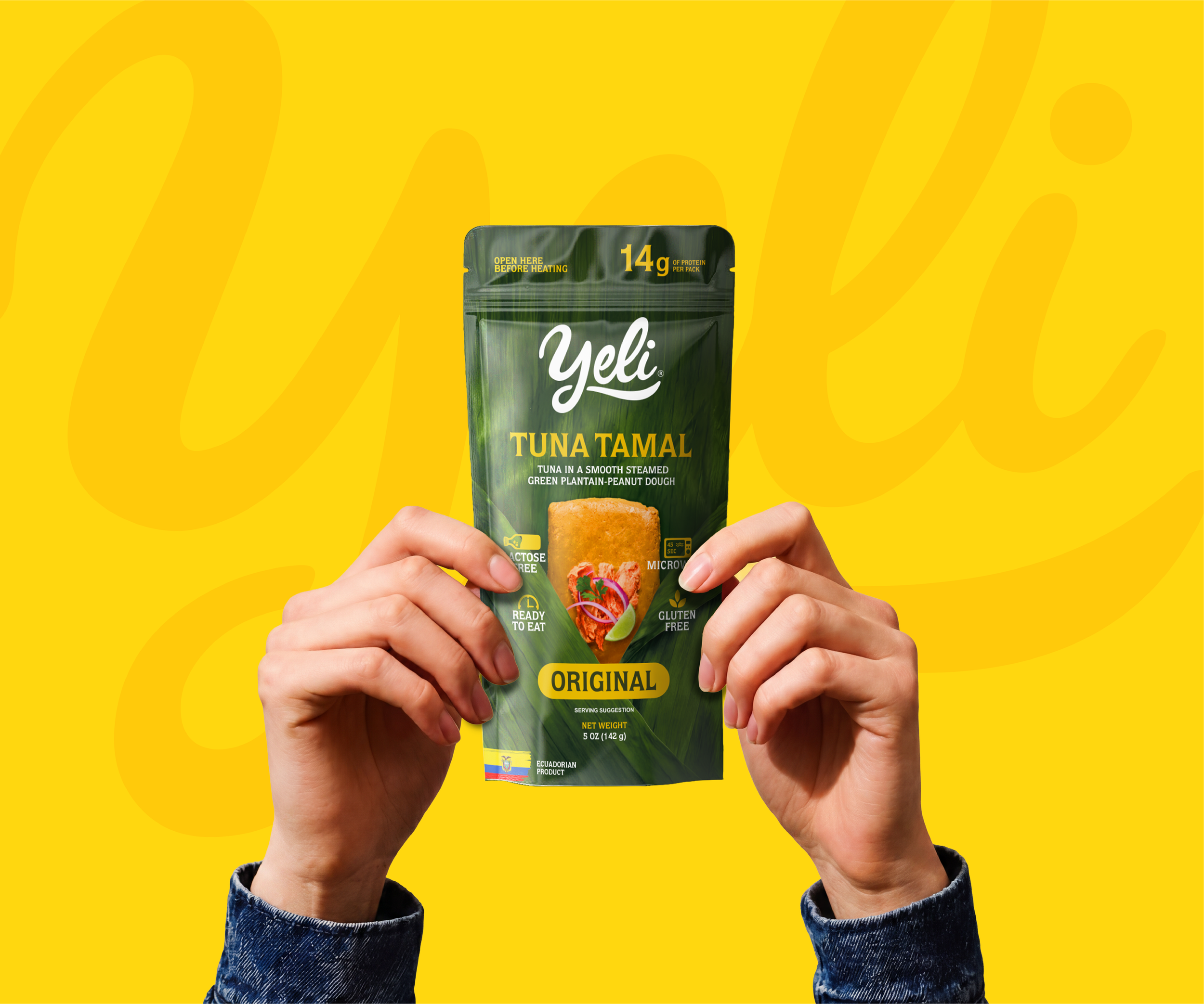
Yeli
A traditional product redesigned for modern convenience
Yeli needed a packaging system capable of presenting a familiar Ecuadorian product in a more contemporary, practical and export-ready way.
The project focused on transforming the tuna tamal into a product that could communicate its origin, nutritional value and convenience at first glance—without losing the cultural character that makes it distinctive.
Project Scope
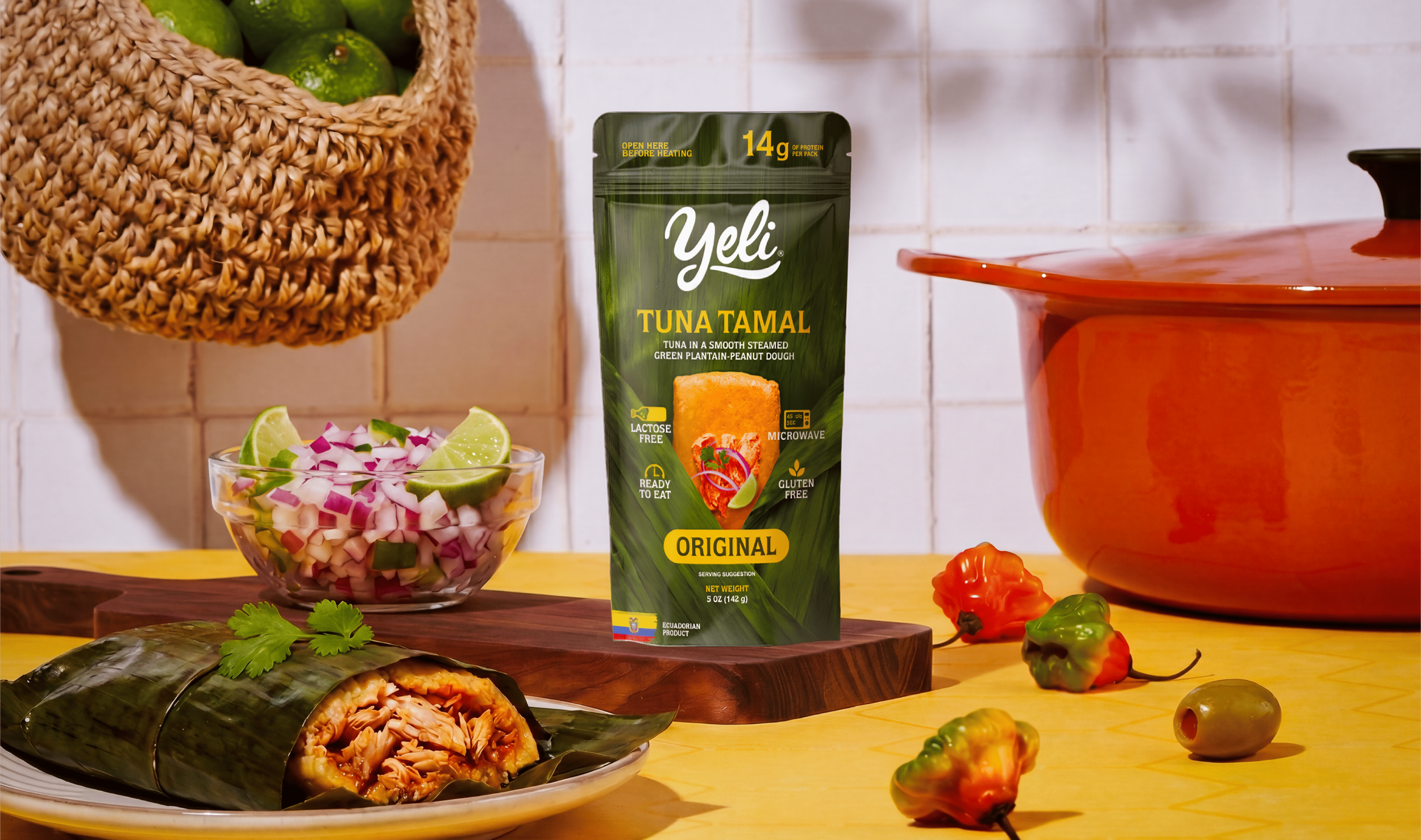
Packaging Strategy
Packaging Design
The tamal category is strongly associated with traditional visual codes, while ready-to-eat and health-oriented products tend to communicate through more modern, functional systems.
The challenge was to position Yeli between both worlds: preserving the authenticity of an Ecuadorian product while making it feel more contemporary, convenient and relevant for consumers looking for practical food options. The strategy focused on clarity, appetite appeal and functionality. Competitive analysis helped identify an opportunity for a cleaner and more innovative presentation within a category dominated by more conventional packaging.
The Challenge and Strategy
We developed a stand-up pouch that transforms the banana leaf—one of the tamal’s most recognizable elements—into the main visual language of the package.
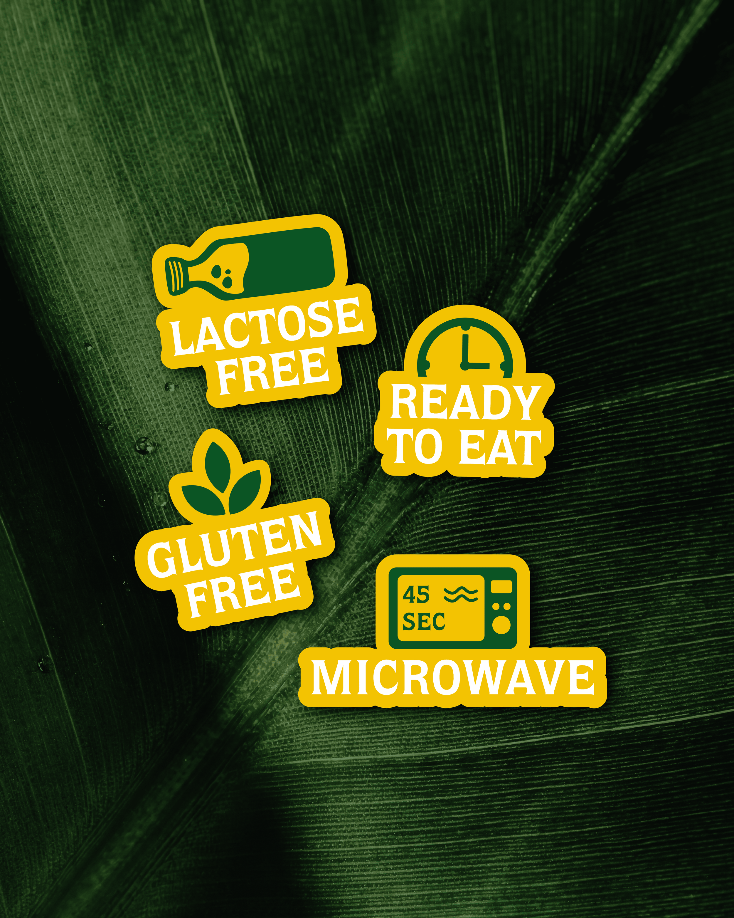
The deep green structure creates a strong natural association, while the product window reveals the tamal directly and reinforces freshness and authenticity. Clear nutritional and functional claims—protein content, lactose free, gluten free, ready to eat and microwave preparation—are integrated into the front panel to make the product easy to understand at a glance.
Gold accents add warmth and differentiation, while the Yeli wordmark introduces a softer, more approachable contrast to the structured information hierarchy. The result is a packaging system that makes a traditional Ecuadorian product feel more contemporary, convenient and internationally relevant—while keeping its origin visible at the center of the experience.