Skole
An identity designed to bring precision to every day
Skole needed to evolve from a recognized uniform provider into a clearer, more contemporary brand—one capable of expressing the quality of its products, the strength of its service, and its role as a trusted partner for schools and families.
The project brought together strategy, identity and communication to create a distinctive system built around precision, reliability and everyday experience.
Project Scope
Brand Strategy
Brand Identity
Verbal Identity
Brand Experience
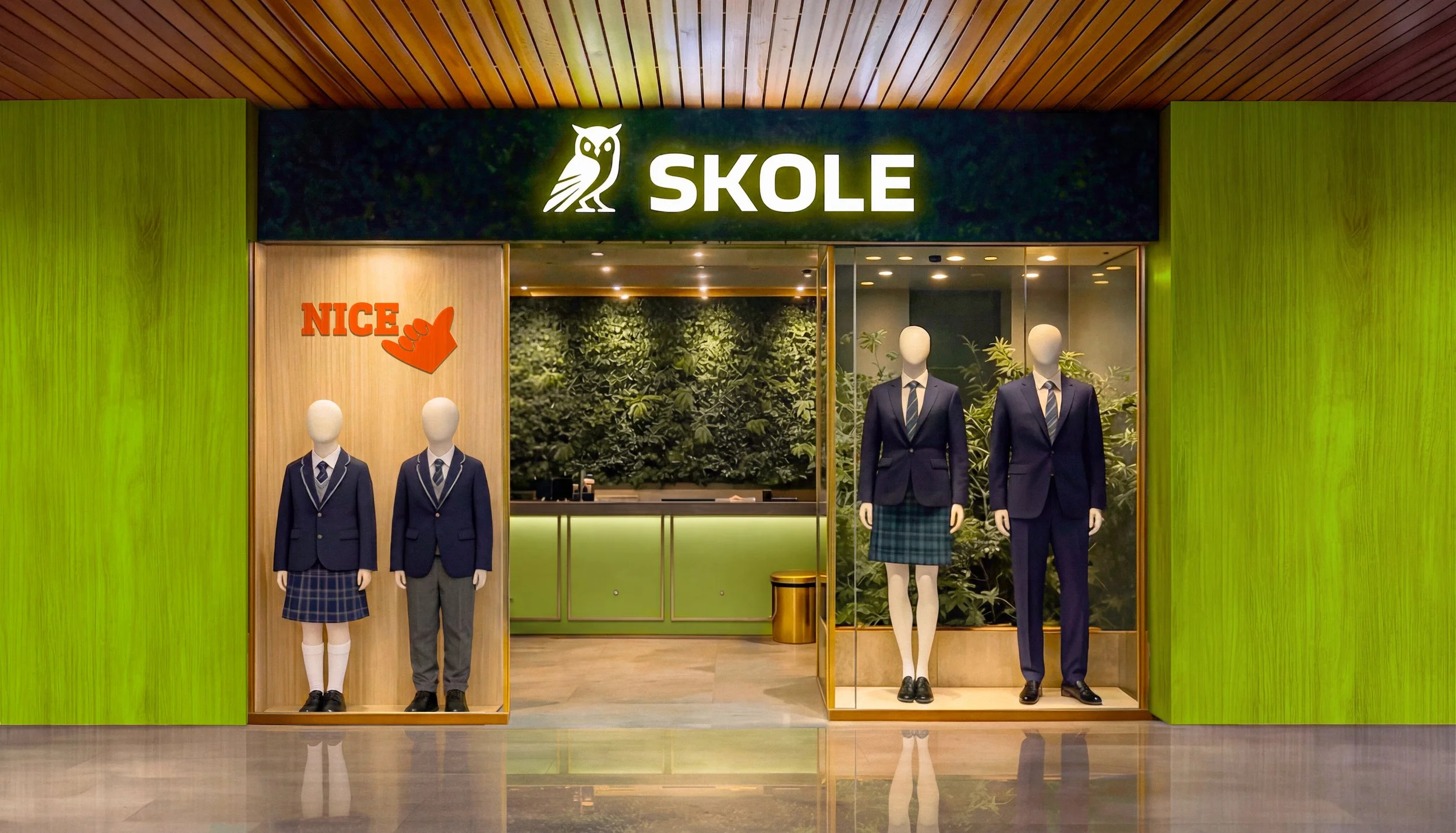
Skole had built a strong reputation through the quality of its uniforms and a service model centered on constant support. However, its identity did not fully communicate the scale or specialization of the brand and could easily be mistaken for an educational institution rather than a company dedicated to uniforms. The challenge was to create greater clarity while preserving the trust Skole had built over time. We defined a strategic direction around precision, expertise and care, positioning the uniform as part of a broader service experience rather than simply a product. This approach allowed the brand to speak simultaneously to schools, families and students, while creating a structure capable of supporting new institutional segments and future growth.
The Challenge and Strategy
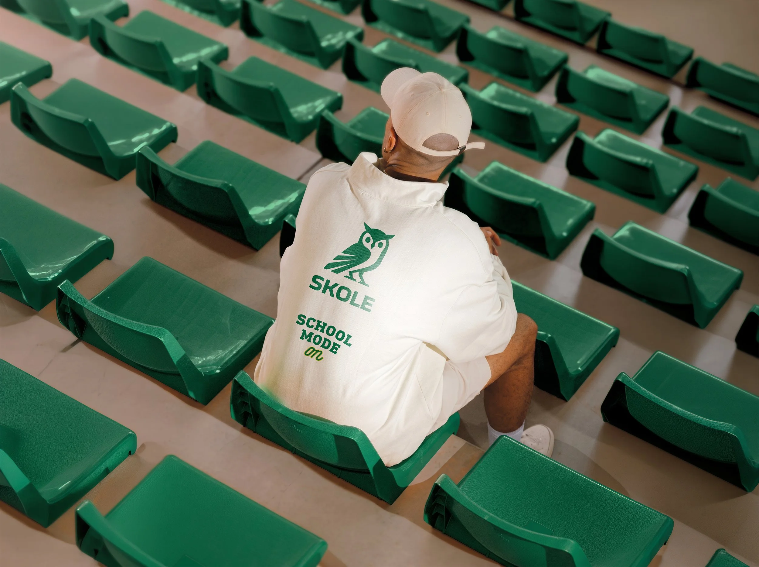
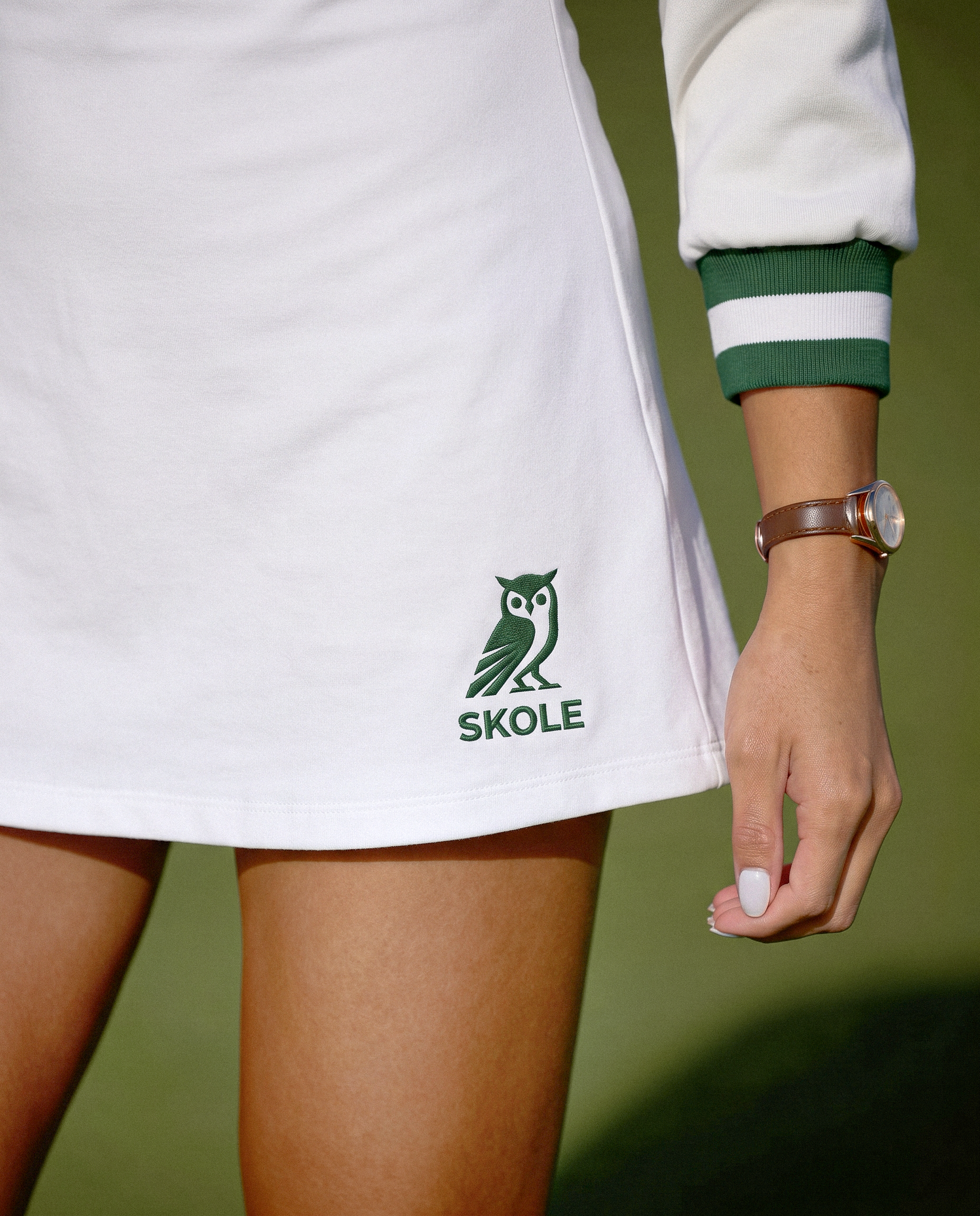
We developed a visual identity that balances the reliability of the educational world with a more contemporary and expressive character. At the center of the new identity is a geometric owl, a recognizable symbol associated with knowledge, observation and confidence. Its sharper, more compact construction gives SKOLE a stronger presence while maintaining a clear connection with the academic environment.
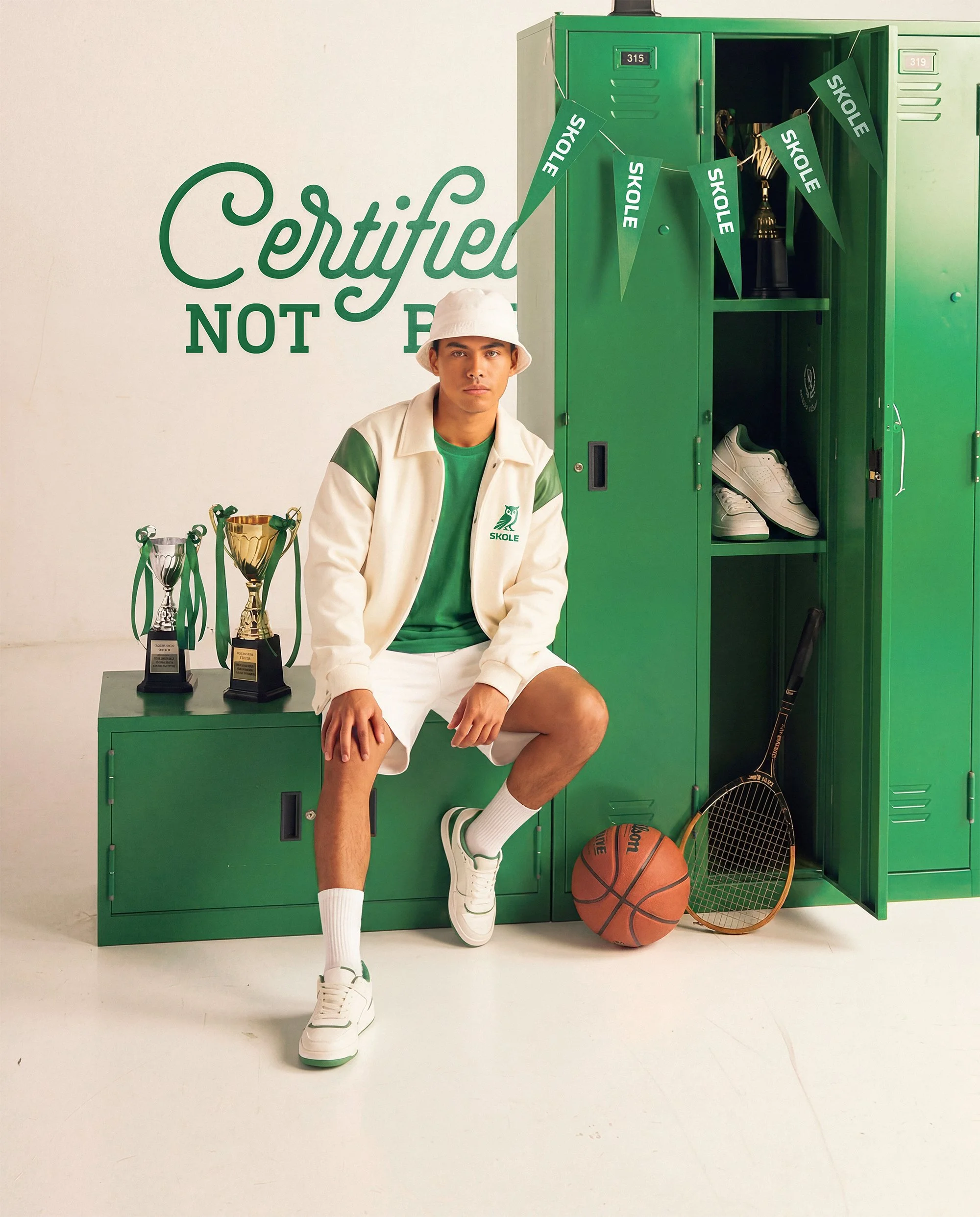
The identity is built around a deep green palette, a high-impact secondary green and an extended set of expressive colors used in more playful applications. Typography, photography, graphic compositions and messaging work together to create a system that moves naturally from institutional communication to student-facing touchpoints.
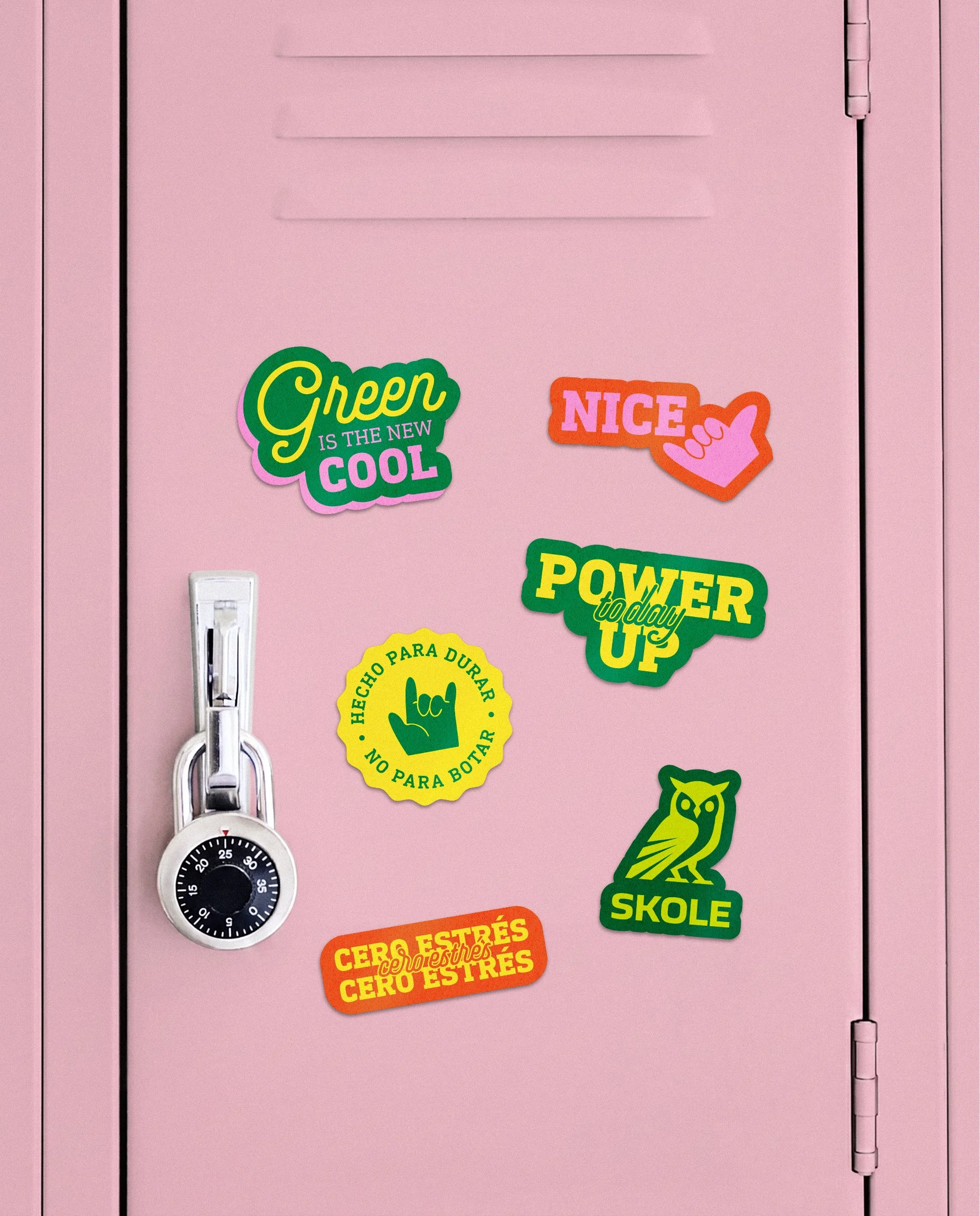
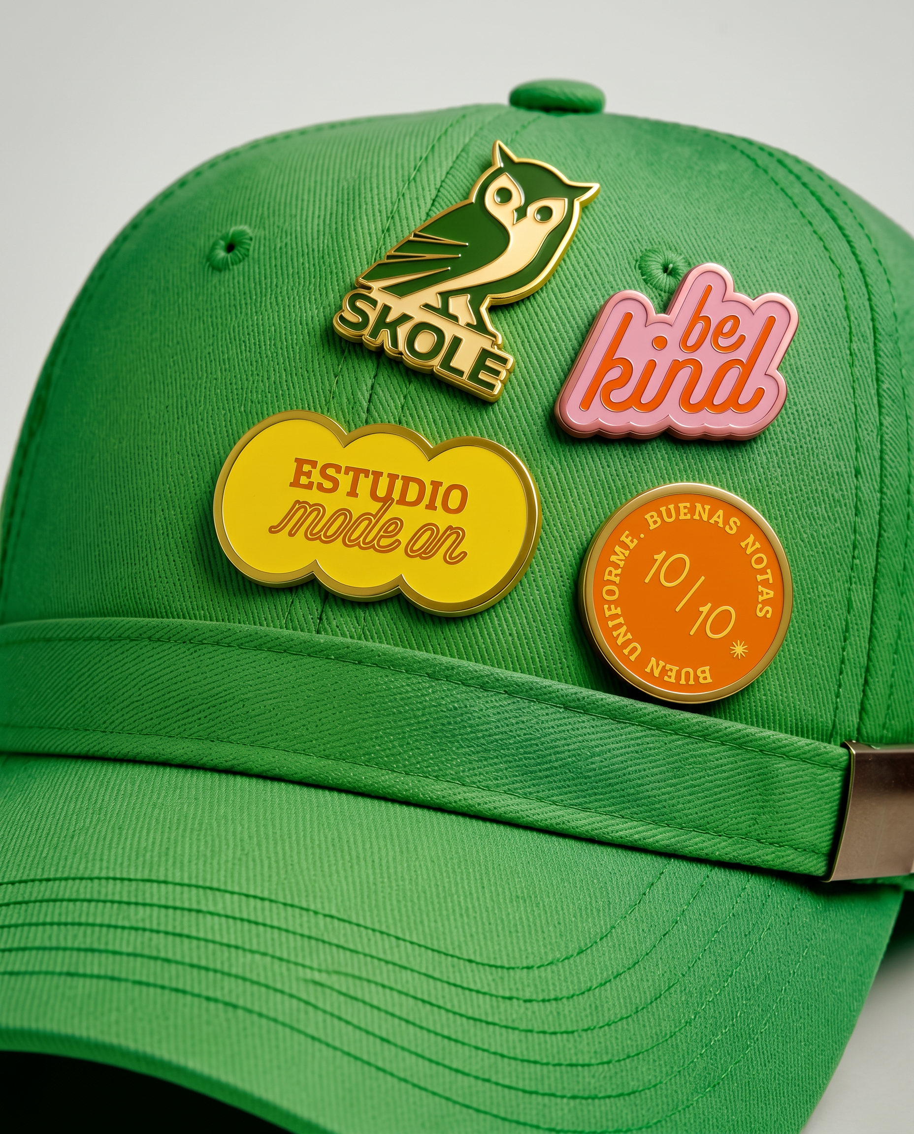
Brighter secondary colors are reserved for stickers, merchandise, tags and other high-interaction pieces, allowing the brand to feel fresher and more approachable without weakening its primary identity. The result is a clearer and more flexible SKOLE: a brand prepared to organize different lines, communicate with multiple audiences and turn its promise of quality, service and precision into a recognizable experience.
The Solution